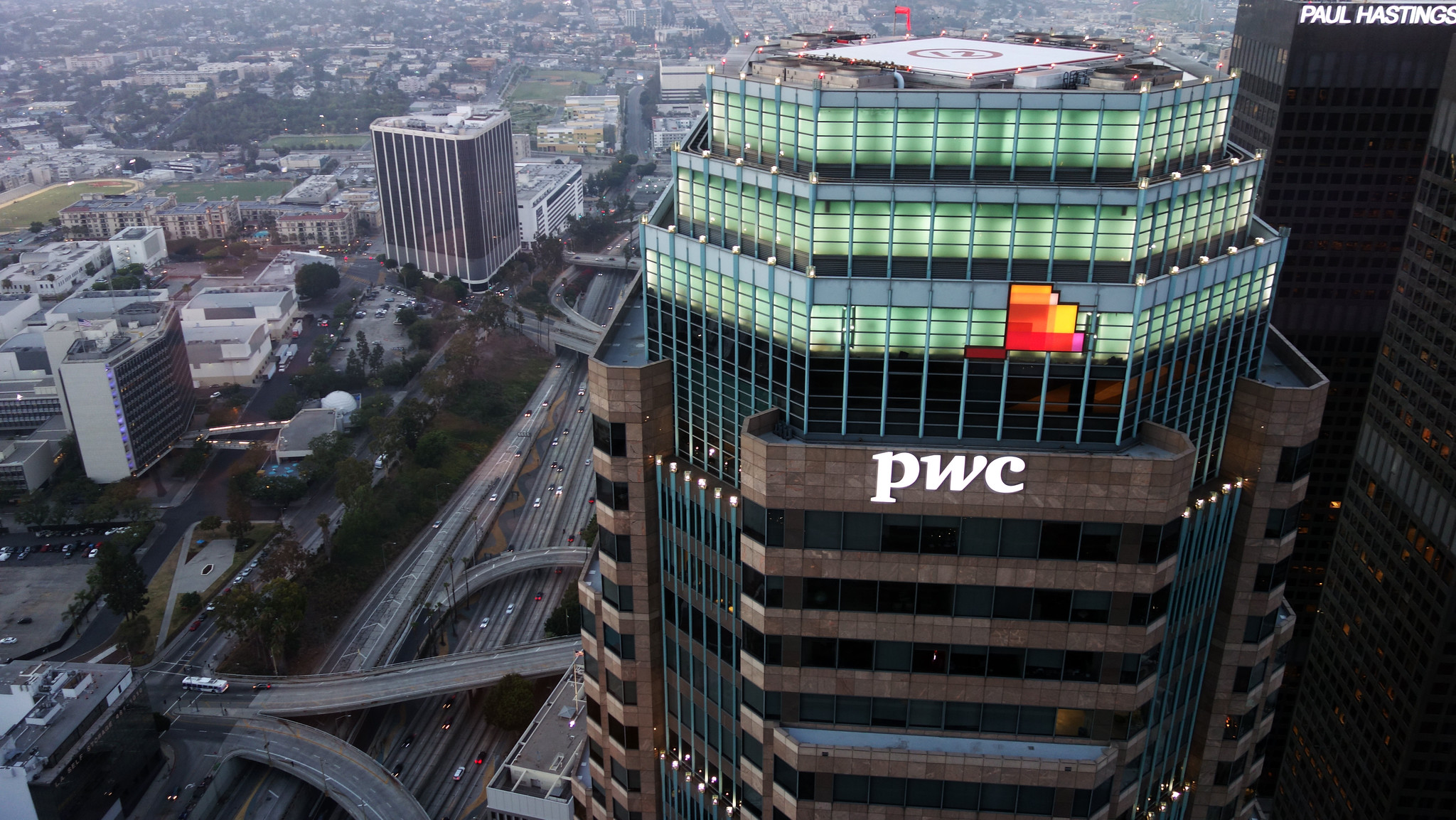
PwC has unveiled a new logo—its first brand refresh in almost 15 years—that the Big Four accounting firm says “reflects how the firm already works: fast, sharp, and focused on what’s next.”
The new logo, which will now be used across the PwC global network of accounting firms, made its first public appearance yesterday when it was announced that PwC was named the official consulting partner of Formula 1.
The multiyear agreement will see PwC “provide strategic consulting to Formula 1 across key areas of its global business to help enhance performance and the sport’s drive for operational excellence,” an April 29 media release says.
PwC will benefit from a range of access to the sport as part of the agreement, including signage at select races and the opportunity to host clients and stakeholders at Grands Prix throughout the season.
“We’re entering a bold new chapter—driven by sharp thinking, deep expertise, and an unwavering focus on what’s next,” Paul Griggs, PwC US senior partner, said in a statement. “In a world that’s changing faster than ever, we are reshaping how we deliver value as we drive our clients to the leading edge.”
“This brand evolution reflects the PwC our clients already experience,” added Kristin McHugh, PwC US chief marketing and communications officer. “We’ve modernized the way we show up to match the strength of what we deliver. Our strategy is clear, our capabilities are deep, and our people are what make it real—and we continue to put our clients at the center of everything we do.”
AdAge reported in February 2024 that PwC had appointed Interpublic Group of Cos.’ McCann as its global creative agency. McCann says on its website that it “helps brands build the most meaningful brand platforms that drive exponential growth and leave a lasting impact on culture.”
CPA Practice Advisor hasn’t confirmed yet whether McCann was the creative force behind PwC’s new logo.
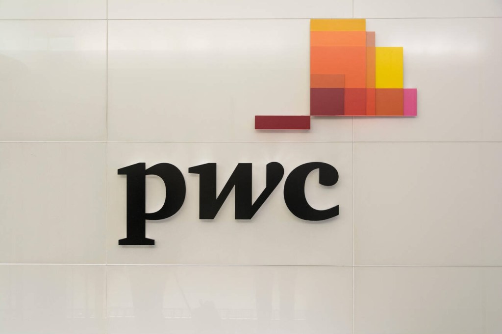
In an article Tuesday on the PwC logo, Marketing Week wrote that the new look is part of PwC’s new global platform, “Catalyst for Momentum,” and includes a simplified logo featuring an orange “momentum mark”—an upward, forward design inspired by the “W” in PwC.
Antonia Wade, PwC’s global chief marketing officer, told Marketing Week that while PwC has high brand recognition, the accounting firm felt its previous visual identity looked “dated” when placed alongside some of its tech partners.
“We had a lot of colors in our system. We felt like we were sometimes a bit confused and confusing in the market,” she said to Marketing Week.
PwC last rebranded in October 2010 when it formally shortened its brand name from PricewaterhouseCoopers to PwC and unveiled the logo that was just replaced. At the time, Going Concern reported that a PwCer wasn’t a fan of the new fall color-ish logo, calling it “a throwback—a ’70s color scheme meets an IT startup.”
This PwC employee also was very concerned about the environmental impact changing the firm’s logo would have.
“I can’t imagine that this won’t set back the Firm-wide goal of reducing our carbon footprint. Letterhead, business cards, report covers, envelopes (to name a few paper products) all need to be reprinted. It seems like an incredible waste to discard everything we already have in favor of this new brand (we received an email letting us know that after October 4th we are not to use any of the old paper products),” the employee wrote in an email to Bob Moritz, who was PwC US chairman and senior partner at the time, that Going Concern obtained. “I hope we are at least planting a bunch of trees to help compensate Mother Nature for the amount of paper that will be wasted with this change.”
A “revitalization,” not a refresh
Marketing Week reported on how the ball got rolling on this most recent rebranding at PwC:
When Wade joined the company in July 2021, she noted people “hadn’t paid attention to the brand for some time”.
“It felt like it was time for us to start looking at it,” she explains.
The process began around 18 months ago with an extensive global survey, aimed at understanding client buying behaviours across services and what mattered most to both current and future employees. However, leadership changes last year meant pausing and restarting the process until the changes were made.
“We had a lot of different factors that we needed to take into consideration, and a lot of people that we needed to take on the journey,” she adds.
Following the research, one major insight was that technology-driven purchases are becoming more complex, involving larger groups of decision-makers, particularly tech executives.
“These buying circles get bigger and bigger, and the role of the technology executive in the organisation is becoming more and more prevalent,” she adds. “We felt like perhaps we could do a better job of articulating where we had strengths, and how we could appeal to that broader set of buyers.”
As PwC considered how to evolve its brand platform, input from clients and analysts reinforced the idea that the firm’s value lies in enabling momentum – helping businesses move forward.
“Clients told us: ‘We as clients are the ones that need to drive momentum in our business, but what you do is you come in and you enable that’,” she notes.
Wade added, “We didn’t think of it as a refresh. We thought about it more as a revitalization. It was quite an interesting challenge for us as marketers and brand people to think about how we show and signal that we are a different type of PwC, without losing some of those things that have made us successful in the past.”
The new PwC look has gotten mixed reviews on sites like Fishbowl and Reddit. One person wrote that the new logo “looks a little cleaner” than the previous one. Another person thought the orange lines “kind of look like a checkered flag,” associating the new logo with the firm’s partnership with Formula 1. This PwCer wrote, “I barely register a difference with the old logo. I suppose my initial thoughts were it looks like the old logo hasn’t loaded properly. It’s not going to change the way I review tax returns though.”
What do you think of the new PwC logo? If you feel like weighing in, head to the comment section below and let us know your opinion of it.
Sign in to get access to this free resource, and all of our whitepapers and reports.
Download this content today!
Register Now Already registered? Click here to Log In
Tags: Accounting, accounting firms, Firm Management, logos, Marketing, PwC